
I recently started using Adobe Illustrator, for my Unit 10 project on abuse through social media. It’s not actually as confusing or as hard as I initially thought it would be, and honestly isn’t too different from using Photoshop, except that Photoshop primarily works with pixels, and Illustrator with vector.
Here’s my process while going through some basic tutorials, testing different tools and functions, and making a draft poster.
On a separate document, I tried out some of the different tools and functions on Illustrator through making and altering shapes. Thankfully, even if it’s on the same layer, each shape can be selected and altered individually (unless you’ve merged them using the Shape Builder tool), so if you make a mistake or need to alter something it’s pretty easy.
Some of the functions and tools seemed a bit buggy at first, or needed specific keyboard commands to use properly, but the tutorials I was following – “Adobe Illustrator – Mastering the Fundamentals” on Udemy – may have been on a different version of the software than I was using.
As I use Photoshop quite a lot when making work, it’s strange to find myself restricted from drawing and editing freely. So far in Illustrator, I found it’s easier to try making a new shape rather than trying to edit an existing one, but I do need much, much more practice.

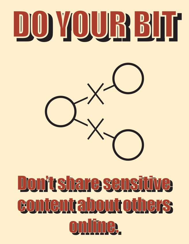
Using different skills I learned from a day’s worth of tutorials, I made this draft version of my favourite design from my thumbnail sketches.

I later reworked the symbol on the poster, as I felt that it was too tall. I shrunk the entire image, widened the Xs, and altered the circle size and line thickness, and also spread them a little further apart.
Next, I started working on type. I tried using different fonts, colours, and effects. I also used old World War propaganda posters as my main source of inspiration.


I found that quite a lot of old propaganda posters used primarily black and red inks, and as the paper got older it turned into a creamy yellow tone. I kept this in mind, though when I found a final design I did still experiment with colour schemes later on.
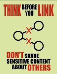
Looking at my design from afar, I noticed there were a few issues with the text and symbol. The drop shadow of the text was contrasting the flat symbol too much, and all attention from the eye was drawn away from it. I did however like the font style, but wanted to play around with the dimensions and line spacing.

By this point, I also decided to change the actual wording of the poster too, as it didn’t sound as smooth as I initially thought it would. I dropped the word “online” from the bottom text, and switched to “Think before you Link” for the top text. I feel like this is a much better title for a poster campaign, and suits the image really well. I also made some minor adjustments to the share symbol itself, making the line width thicker and making the Xs stand out more by adding colour. Though I was a really big fan of the red, cream, and black, I wanted to just test out some colour variations to see how it might change the mood of the image.


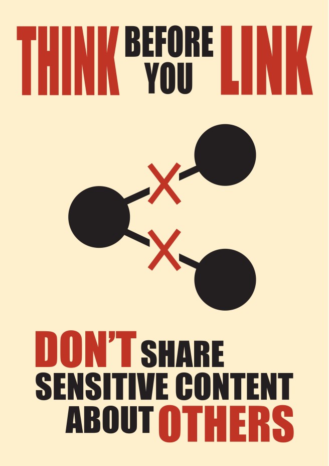
Surprisingly, using Adobe Illustrator has actually been really fun, though I still only have a grasp of the basics. I had enough time on the project to make a second poster, using a different share symbol (which took significantly less time), that I think really makes this look like a real poster series.


Here are the two posters, side by side:


